
Adobe Color vs. Camera Matching Profiles: Decoding Presets for Stellar Photos
Adobe Color is usually the best default with third-party presets because it gives a more consistent, “universal” RAW starting point. Use Camera Matching profiles when you want your RAW to resemble ...

Unlock Perfect Edits: The Ultimate Guide to Fixing Camera Profile Mismatches
If your Lightroom preset looks “wrong,” the problem is often the camera profile—not the preset. Profiles (Adobe Color vs Camera Matching) set the RAW color/tone foundation before any slider...

RAW vs. JPEG: Unraveling the Mystery of Why Your Presets Go Rogue!
Lightroom presets can look amazing on RAW but “wrong” on JPEG because JPEGs already have contrast, color, sharpening, and white balance baked in. Learn how to match both with a consistent profile, ...
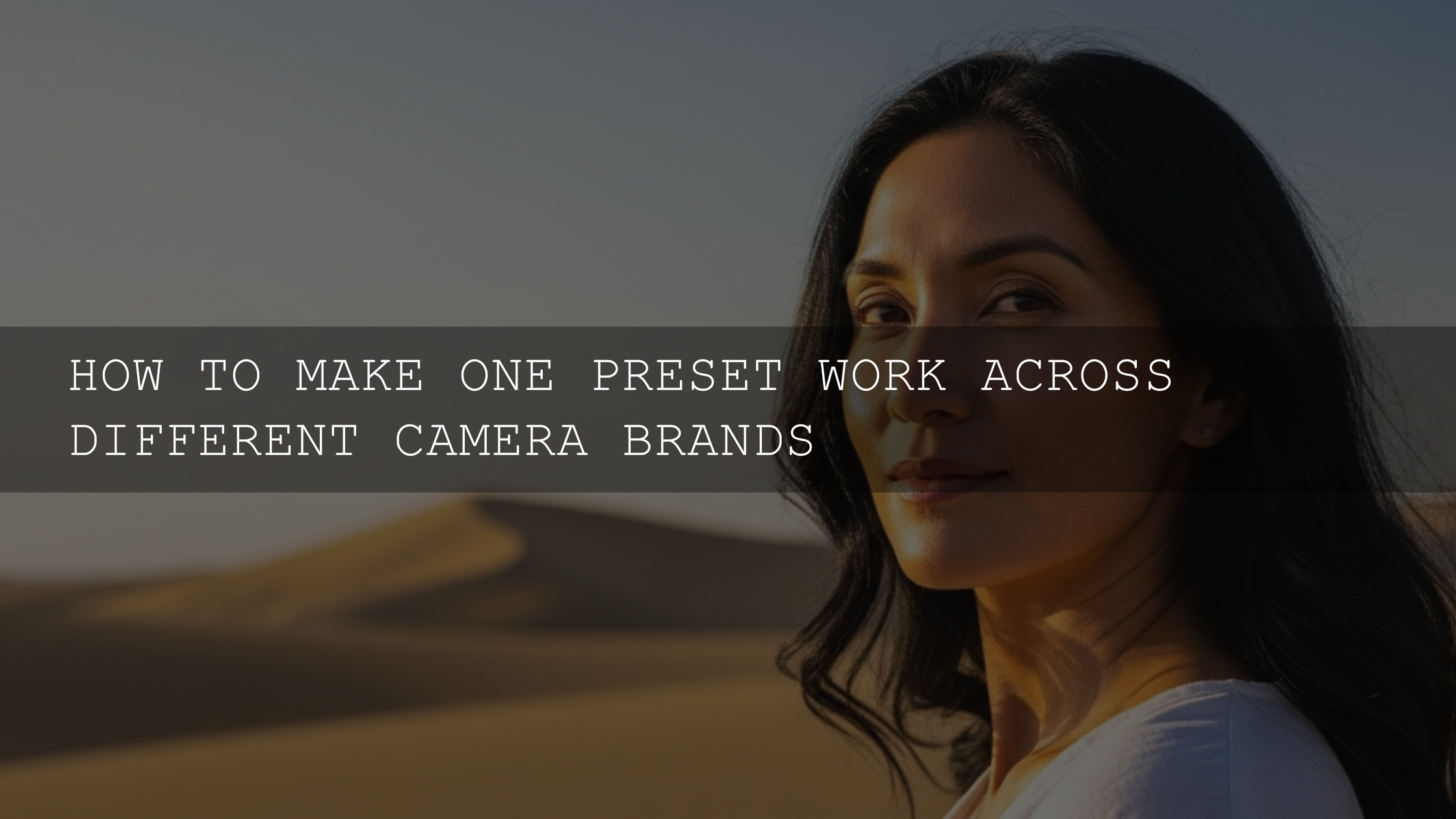
Mastering Your Edits: How to Make One Preset Work Across Different Camera Brands
The same preset can shift between camera brands because profiles, color science, and tone response start differently. Learn a simple “normalize → style → refine” system—profiles, WB, HSL/Color Mixe...
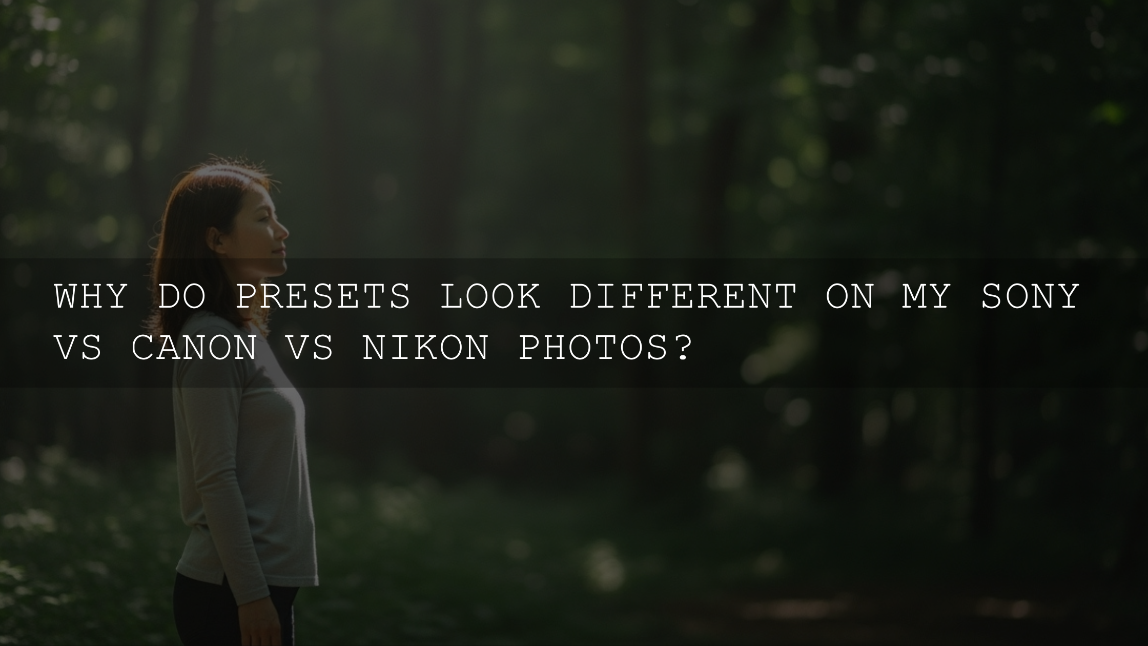
Sony vs. Canon vs. Nikon: Why Your Presets Are Acting So Different!
Lightroom presets look different on Sony, Canon, and Nikon because your RAW baseline (profiles, color science, tone, noise) changes. Learn a simple 2026 workflow—lock profiles, set WB/exposure, app...
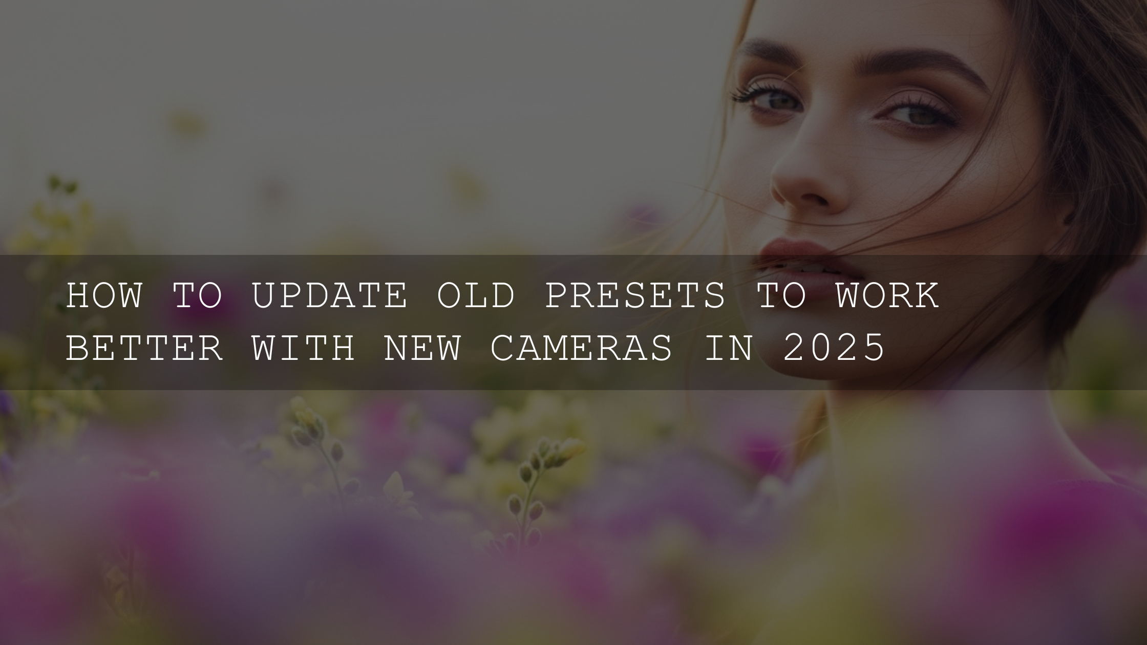
Revive Your Old Presets: Making Them Shine with New Cameras!
New 2026 cameras change the RAW “starting point” (dynamic range, noise, sharpness, and color rendering), so older presets can suddenly look too dark, too harsh, or oddly colored. This guide shows h...

Beyond the Haze: Mastering the Art of Fixing Cyan and Purple Skies in Your Photos
Skies “break” easily because presets push Blue/Aqua, white balance, and curves in smooth gradients. Learn the 60-second rescue (Sky mask + HSL) and the pro method (masking zones + curve/grade) so y...