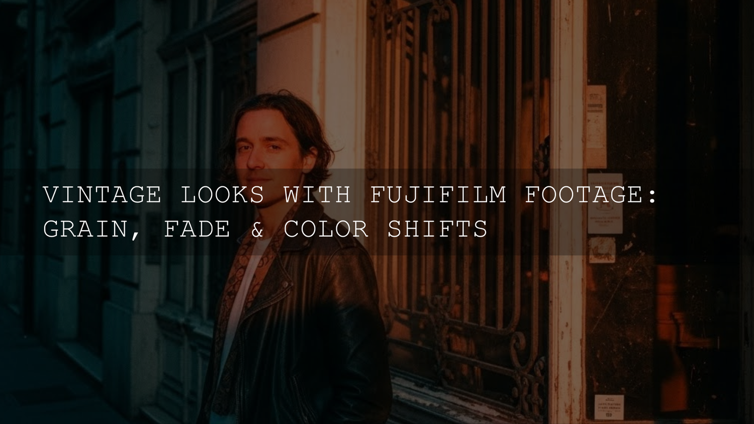
Fujifilm Vintage Film Look: How to Nail Grain, Fade, and Color Shifts
If you’ve been chasing a Fujifilm vintage film look lately, you’re not alone. In 2025, we’re surrounded by crispy, clinical digital clarity — and that’s exactly why film-inspired texture and color are having such a strong moment again. The magic isn’t just “slap on a filter.” It’s understanding how grain, fade, and color shifts work together so your images feel intentional, emotive, and timeless.
Whether you shoot street, travel, portraits, or documentary-style stories, Fujifilm’s film simulations already give you a beautiful head start. But when you pair smart in-camera choices with a tight editing workflow, you can build a signature vintage style that still feels modern.
If you want a fast, reliable starting point for this aesthetic, you can explore a dedicated film-inspired pack like Vintage Film Lightroom Presets and browse the wider range in Lightroom Presets Collection. If you’re ready to experiment across multiple looks, you can Buy 3, Get 9 FREE when you add 12 to your cart — an easy way to test different levels of grain, fade, and color without locking yourself into one vibe.
Why the Vintage Aesthetic Still Hits So Hard
Vintage isn’t just nostalgia for nostalgia’s sake. A good film-inspired grade does three things modern digital images sometimes struggle with:
- It adds texture that makes the image feel tactile and “real.”
- It softens contrast so the mood feels gentler and less harsh.
- It introduces color personality — the subtle quirks that make a photo feel like a memory, not just a record.
That’s why the best Fujifilm film simulation recipes and vintage presets don’t scream for attention. They whisper — and that quiet confidence is exactly what makes them timeless.
The Three Pillars of a True Film-Inspired Look
1. Grain: The Texture That Gives Your Images Soul
Grain is often misunderstood as “noise.” But film grain is more like a gentle veil of character that sits on top of your image and ties everything together.
- It adds depth to flat digital surfaces.
- It blends tonal transitions in a more organic way.
- It instantly signals “film language” to the viewer.
In-camera: Many Fujifilm bodies let you control grain strength and size. A moderate grain setting often looks more believable than going full “coarse” on every scene.
In Lightroom: Grain becomes your finishing tool. Add it after your exposure and color work so you’re not fighting your own texture.
2. Fade: The Soft Lift That Makes Shadows Feel Like Memories
Fade is the quiet hero of vintage editing. It gently lifts the blacks and reduces harsh contrast, creating that relaxed, dreamy film print vibe.
- Perfect for portraits and travel where you want tenderness and warmth.
- Great for street when you want mood without crushing detail.
- Useful for harsh daylight to reduce that “digital bite.”
Think of fade as a mood-setting tool. You’re not removing contrast — you’re reshaping it so the image feels human.
3. Color Shifts: The Signature Fingerprint of Film
Classic film stocks weren’t neutral. They had personalities: warm highlights, cooler shadows, greens with a slight push, reds that felt softer, blues that leaned cinematic. This is where Fujifilm’s color science shines.
Film simulations like Classic Chrome, Astia, and newer profiles (depending on your model) already give you a base you can refine. In post, tiny HSL and white balance adjustments make that base feel uniquely yours.
A Simple Step-by-Step Workflow (In-Camera + Lightroom)
This is a repeatable recipe for building a consistent Fujifilm vintage film look without overcooking your files.
Step 1: Choose the Right Film Simulation Base
Start with a simulation that matches your story:
- Muted documentary feel: Classic Chrome-style bases.
- Soft portraits: gentler, skin-friendly profiles.
- Bold travel color: a richer, more saturated base.
If your camera allows it, keep highlight and shadow settings modest. Overly extreme settings can lock in a look that’s harder to refine later.
Step 2: Nail Exposure for the Mood
Film-like images often feel slightly airy. Underexposing too much can make your vintage edit look muddy once you add fade.
- Protect the highlights.
- Keep skin tones clean.
- Let shadows breathe.
Step 3: Do a Clean “Foundation Edit” in Lightroom
Before any stylization:
- Correct white balance gently.
- Balance exposure and contrast.
- Adjust skin tones first (if relevant).
You can deepen your editing fundamentals using Adobe’s official Lightroom overview and refine your color choices with Adobe Color’s harmony tools.
Step 4: Add Fade with Intention
Lift blacks slightly and reduce contrast in a controlled way. Your goal is subtle softness, not a washed-out haze.
Step 5: Shape Color with Small, Specific Moves
Try these micro-adjustments:
- Warm highlights a touch for nostalgia.
- Cool shadows slightly for cinematic balance.
- Reduce overly neon greens.
- Nudge blues toward a softer, calmer tone.
Step 6: Finish with Grain
Grain should feel like it belongs to the image. Add it last and view at 100% and fit-to-screen to ensure it doesn’t look like digital noise.
Real-World Use Cases You Can Copy
Street Photography
Street work benefits from restrained contrast and visible texture. A moderate fade keeps shadows readable, while fine-to-medium grain adds that documentary realism.
Pair that with a film-inspired preset base like Street Lightroom Presets Bundle and reinforce your style with consistent edits across an entire set.
Travel and Lifestyle
For travel, your vintage look should honor the location. Warm highlights and slightly subdued saturation can create postcard-like nostalgia without turning your photos orange and flat.
Portraits
Skin tones are your truth test. If the face looks healthy and dimensional, your vintage grade is probably working. If skin turns gray, green, or overly matte, back off the fade and reduce extreme color pushes.
Presets vs Manual Editing vs Fujifilm In-Camera Recipes
This is where many creators get stuck — so here’s a clean way to decide.
- Fujifilm film simulation recipes: Best for speed and consistency straight out of camera. Great for daily shooting and social sharing.
- Lightroom presets: Best for repeatable style and faster professional workflows. Ideal when you’re delivering sets to clients or building a brand look.
- Manual editing: Best for precision and one-off hero images. Perfect when you want absolute control over specific colors and tones.
The sweet spot for most photographers is this: use a film-simulation-inspired preset for your base, then refine manually for the final 10–20%.
Pro Tips for a More Believable Film Look
- Don’t overdo all three pillars at once. If grain is strong, keep fade lighter. If fade is heavy, keep color shifts subtle.
- Match your grain to your subject. Fine grain for portraits, slightly stronger grain for gritty street.
- Keep one color “anchor.” Let skin tones or a key environmental color stay natural so the look feels grounded.
- Edit a set, not just a single image. Vintage styles feel more authentic when they’re consistent across multiple photos.
A Quick Mini Recipe You Can Try Today
- Pick a subdued Fujifilm simulation base.
- Expose slightly brighter than you think (without clipping highlights).
- In Lightroom, reduce contrast a little and lift blacks gently.
- Warm highlights slightly; cool shadows a touch.
- Lower saturation of aggressive greens.
- Add fine-to-medium grain at the end.
This alone can move your images from “digital with a filter” to “modern frames with vintage soul.”
Related Reading
- Fujifilm color matching workflows for consistent edits
- How to match mixed-camera footage and stills
- Lightroom color grading fundamentals for cinematic results
- Vintage street editing ideas and preset strategies
Build a Consistent Fujifilm Vintage Style Without Overthinking It
The best film-inspired work in 2025 isn’t about chasing “the one perfect preset.” It’s about understanding the language of film, then using tools that help you speak it fluently. Grain gives texture, fade shapes nostalgia, and color shifts deliver signature personality. Once you learn how they interact, the look becomes repeatable — and truly yours.
If you want a shortcut that still leaves room for your personal taste, start with Vintage Film Lightroom Presets, then expand your toolkit through the Lightroom Presets Collection. You can mix and match styles for different genres, and if you’re stocking up, you can Buy 3, Get 9 FREE when you add 12 to your cart.
For creators who also grade motion, pairing your stills style with a matching video pack like 700+ Cinematic Video LUTs can help keep your brand identity consistent across photo and film.
How do I get a Fujifilm vintage film look without heavy editing?
Start with a film simulation that already leans muted or soft, then enable moderate in-camera grain. Expose carefully for highlights and keep shadow settings gentle to avoid harsh contrast.
Should I add grain in-camera or in Lightroom?
In-camera grain is great for speed and consistency. Lightroom grain offers more control and is ideal when you’re refining a signature style for client work or curated portfolios.
Why does my faded look feel washed out?
You may be lifting blacks too aggressively or reducing contrast too much. Try dialing back the fade and rebalancing midtone contrast so the image stays dimensional.
Are presets better than manual editing for vintage styles?
Presets are excellent for a consistent starting point and faster workflows. Manual tweaks help you tailor skin tones, greens, and blues so the result feels personal and scene-accurate.
Can I match my vintage photo look to video?
Yes — using complementary Lightroom presets and video LUTs can unify your brand aesthetic. Keep contrast and color shifts consistent across both mediums for the most believable result.
Written by Asanka — creator of AAAPresets (10,000+ customers).
Leave a comment
This site is protected by hCaptcha and the hCaptcha Privacy Policy and Terms of Service apply.