
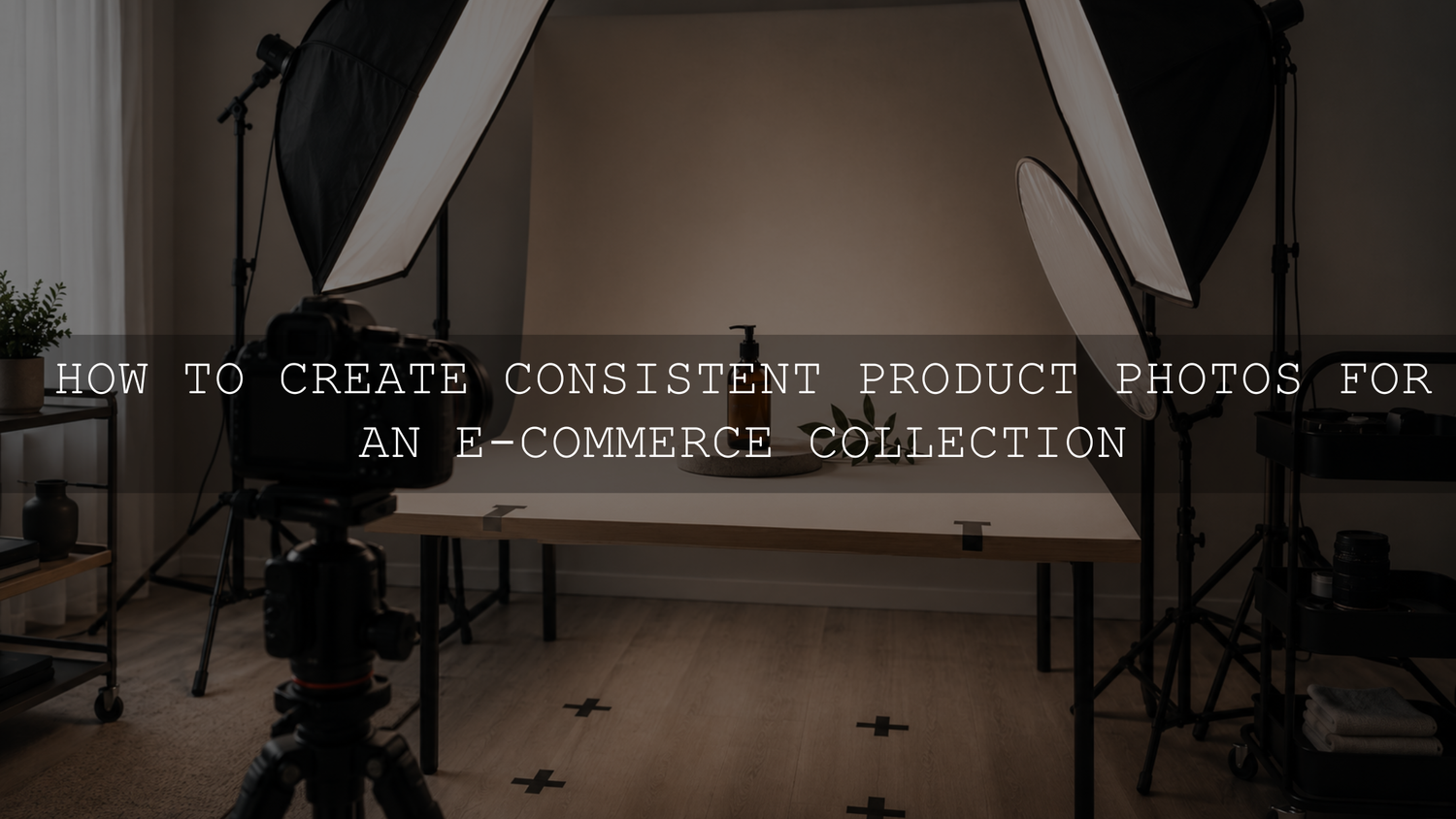
Consistent product photos are created before the editing begins. The most reliable approach is to standardize your background, product position, camera perspective, lighting, exposure, white balance, crop, and export settings—and document them so the setup can be rebuilt later.
You do not need a permanent commercial studio. A small tabletop or spare-room setup can produce a cohesive online catalog when every important variable is measured and repeated. This guide explains how to build that system without forcing every image to look identical.
Define What Consistency Means for Your Store
Visual consistency does not mean using one photograph repeatedly or removing every creative decision. It means that images serving the same purpose follow the same visual rules.
For example, the main catalog images in a collection might share:
- The same background color and surface
- A similar product size within the frame
- The same camera height and perspective
- A consistent shadow direction and softness
- Neutral, believable product color
- The same aspect ratio and crop position
- A predictable sequence of product angles
Lifestyle photographs can follow a separate system. They may use models, props, locations, or more dramatic lighting while still maintaining a recognizable color treatment. The important principle is to establish one standard for each image type instead of expecting catalog, detail, scale, and lifestyle photographs to follow identical rules.
Create a Product Photography Specification Sheet
Before photographing the first product, create a simple specification sheet. This becomes the reference for future shoots and prevents the setup from depending on memory.
Record the following information:
- Backdrop material, brand, color, and finish
- Shooting surface and any reflectors or diffusion material
- Tripod position and camera height
- Distance between the camera and product
- Lens or smartphone camera used
- Focal length or zoom setting
- Exposure, ISO, aperture, and white-balance settings
- Light position, height, angle, output, and distance
- Product alignment marks
- Required angles and image order
- Crop ratio, export dimensions, color space, and file format
Photograph the completed setup as well. A behind-the-scenes reference image can reveal details that written measurements miss, such as reflector angle, cable placement, diffusion position, and the direction in which the product faces.
Build a Setup That Can Be Repeated
A repeatable product photography set does not have to remain assembled permanently, but its important positions should be recoverable. Use removable floor tape to mark tripod legs, light stands, table corners, backdrop supports, and the center of the product area.
For small products, create a positioning board or paper template with a center point and alignment guides. This makes it easier to place products at the same distance from the camera. A small turntable can also help maintain repeatable angles, especially when a catalog requires front, three-quarter, side, and back views.
Do not change the camera distance and then compensate by zooming or cropping. Perspective is determined largely by the camera’s position relative to the subject. Two photographs can have a similar crop but still look different if one was taken close to the product and the other from farther away.
For additional guidance on controlling the shooting environment, see the AAAPresets guide to creating clean product photography backgrounds.
Choose Controlled Lighting Over Constant Correction
Lighting differences are among the hardest inconsistencies to correct after a shoot. Changes in direction, brightness, diffusion, or color can alter the appearance of texture, shape, gloss, metal, glass, fabric, and packaging.
Window light can work well for a small shoot, but its intensity and color can change with the weather, time of day, surrounding buildings, and reflections from nearby walls. When products need to be photographed over several weeks or months, artificial lighting is usually easier to reproduce.
The exact Kelvin number matters less than using the same light sources at the same settings and avoiding mixed lighting. Turn off household bulbs when they introduce a second color temperature. Keep daylight from entering the scene when it changes the established artificial-light setup.
For each light, document:
- The distance from the product
- The height of the light source
- The horizontal angle
- The power or brightness setting
- The diffuser, softbox, grid, reflector, or bounce material used
Measure from consistent points, such as the center of the product platform and the front edge of the diffuser. Descriptions such as “light slightly to the left” are difficult to reproduce; measurements are much more useful.
Lock the Camera Perspective and Exposure
Automatic exposure and automatic white balance can change from one product to another. A camera may brighten a dark product, darken a white product, or shift the white balance after detecting a different dominant color. Those adjustments may be technically understandable, but they make a catalog harder to match.
Use manual exposure when your camera or photography application supports it. A practical starting process is:
- Place a representative product in the finished lighting setup.
- Set the ISO as low as practical for clean image quality.
- Select an aperture that keeps the required parts of the product sharp.
- Adjust shutter speed or light output until the exposure is correct.
- Set or lock white balance for the established lighting.
- Capture a test frame and inspect focus, highlights, shadows, and product color.
- Keep the approved settings unchanged while the lighting and product position remain unchanged.
An aperture around f/8 can be a useful starting point on many interchangeable-lens cameras, but it is not a universal rule. Tiny products may need more depth of field or focus stacking, while some lenses begin to lose fine detail at very small apertures. Test the actual lens, sensor, product depth, and output size instead of copying one setting for every situation.
A tripod allows the shutter speed to be slower when the product and lighting are stationary. Use a self-timer, remote release, or tethered capture when pressing the shutter causes visible camera movement.
Smartphone users can follow the same principle by locking exposure and focus when the camera application supports it. Avoid switching unpredictably between different phone lenses because they can differ in field of view, optical distortion, color response, and level of detail.
Keep Focal Length and Camera Distance Consistent
A fixed prime lens is not required. The important requirement is to avoid changing focal length or camera position without documenting the change.
Very wide lenses often require the camera to be placed closer for the same framing, which can exaggerate size differences between the nearest and farthest parts of a product. When space permits, a normal or short-telephoto field of view can make it easier to maintain a natural-looking shape. The appropriate focal length still depends on product size, available space, sensor size, and the intended composition.
Once you approve a perspective, record both the focal length and the camera-to-product distance. A strip of tape on a zoom ring can help prevent accidental movement during high-volume shoots.
Standardize Product Scale, Position, and Angles
Products of different physical sizes should not always occupy exactly the same percentage of the frame. A ring and a large handbag require different framing. However, products within the same category should feel intentionally related.
Create category-specific framing rules, such as:
- Footwear positioned on the same baseline
- Bottles centered with similar space above the cap
- Jewelry photographed at a consistent magnification
- Clothing aligned to the same shoulder or hem guide
- Boxes facing the same direction with matching perspective
Use a standard shot sequence so important views are not forgotten. A useful sequence might include:
- Main hero image
- Direct front view
- Three-quarter view
- Side or back view
- Material or construction detail
- Scale or in-use image
- Packaging or included accessories
Not every product requires every angle. The sequence should reflect what a shopper needs to understand about that product.
Capture a Color and Exposure Reference
At the beginning of every session, photograph a neutral gray card or suitable color reference in the same light as the product. This creates a repeatable starting point for white balance and helps reveal whether the new session has shifted warmer, cooler, greener, or more magenta than the previous one.
Keep one approved product from an earlier shoot available when possible. Photographing that reference product at the beginning of a new session gives you a direct visual comparison between the old and new setup.
A preset cannot recover accurate product color if the new lighting is fundamentally different, the source image is clipped, or the product is reflecting a colored wall. The reference frame helps correct the cause before dozens of products are photographed incorrectly.
Use Presets as a Base, Not a Color Guarantee
Once one representative image has been corrected, save the reusable global adjustments as a preset or synchronize them across photographs captured under the same conditions. Lightroom Classic includes Sync and Auto Sync tools for applying selected Develop settings to multiple images. Review Adobe’s instructions for synchronizing Lightroom Classic settings before applying adjustments to a large catalog.
Settings that are often suitable for batch synchronization include:
- Camera profile
- White balance when the lighting is truly unchanged
- Basic tonal adjustments
- Tone curve
- Color Mixer adjustments
- Lens corrections
- Calibration or consistent color styling
Use more caution when synchronizing:
- Crop and rotation
- Healing or dust-removal adjustments
- Subject-specific masks
- Reflections and local highlight corrections
- Background cleanup
- Product-specific color adjustments
AI-generated masks can be recomputed for additional photographs, but they still need review. Manual brushwork, gradients, healing corrections, and object-specific adjustments may not transfer cleanly between products. Likewise, a white-balance correction that works for a white ceramic item may still need refinement when the next product is reflective metal or translucent glass.
The AAAPresets guide to building a product editing preset set explains how to create reusable editing directions without expecting one preset to finish every photograph automatically.
Check Product Accuracy Before Styling the Image
For e-commerce photography, product accuracy should be evaluated before creative color grading. Compare the edited file with the physical product under neutral viewing conditions when possible.
Pay particular attention to:
- Brand colors and packaging
- White, cream, gray, and black materials
- Metal tones such as silver, gold, and rose gold
- Fabric saturation and undertones
- Wood, leather, and natural materials
- Transparent or reflective surfaces
A stylish preset may shift a product into a more attractive color, but that does not necessarily make it suitable for a product listing. Consider reserving stronger creative grades for banners, advertisements, social content, and lifestyle photographs while keeping main catalog images comparatively neutral.
Compare the Collection as a Grid
Do not evaluate each image only at full-screen size. Display the complete batch as a grid or contact sheet. Differences in brightness, product scale, horizon position, crop, background tone, and shadow density are often easier to notice when images appear next to each other.
During quality control, check:
- Does one product appear much larger than comparable products?
- Does the background become warmer or darker in one image?
- Are products aligned to the same visual baseline?
- Are important edges sharp?
- Are highlights clipped on reflective packaging?
- Are dust, fingerprints, threads, or scratches visible?
- Does the product color remain believable?
- Do all required angles exist?
Correct unusual frames individually instead of applying stronger global settings to the entire batch.
Export Every Catalog Image to the Same Standard
An otherwise consistent shoot can look uneven when images are exported at different ratios, dimensions, sharpening levels, or color spaces.
Create an export preset containing the approved:
- File type
- Color space
- Image dimensions
- Compression or quality setting
- Output sharpening
- File-naming structure
For standard web delivery, sRGB is widely used because it provides predictable compatibility across browsers and consumer devices. Lightroom Classic allows exported files to be converted and tagged with sRGB or another selected color space. Adobe documents these controls in its Lightroom Classic export settings guide.
The best pixel dimensions depend on your Shopify theme, zoom requirements, marketplace rules, and other publishing destinations. Instead of exporting arbitrary sizes, create a master edited file and produce separate platform-ready versions. The AAAPresets Shopify and Pinterest image export guide explains how to maintain consistent aspect ratios while preparing files for different placements.
Common Consistency Mistakes
Moving the tripod to make room
Even a small change in height or distance can alter the product’s perspective. Mark the position and record measurements before dismantling the setup.
Using automatic white balance for every product
The camera may interpret products with different dominant colors differently. Use a fixed or custom white balance for controlled lighting and verify it with a neutral reference.
Mixing daylight and household lighting
Different color temperatures can create color casts that are difficult to remove globally, especially on reflective products.
Synchronizing every Lightroom setting
Global tone and color adjustments may transfer well, while crops, healing corrections, and product-specific masks may not.
Changing camera profiles between sessions
Different profiles can change the starting contrast and color rendering of RAW files. Record the selected profile as part of the editing specification.
Overcorrecting the background
Forcing every backdrop to pure white can remove natural product edges, reflections, and shadows. Keep the background consistent with the intended visual standard rather than assuming every pixel must be white.
Using one style for every image purpose
A clean main listing image, a detailed close-up, and a lifestyle advertisement can follow different creative rules. Consistency should exist within each image category.
A Repeatable Workflow for Every Product Shoot
- Review the product photography specification sheet.
- Rebuild the set using the recorded measurements and reference photos.
- Turn off uncontrolled or mixed light sources.
- Place the camera, lights, background, and product using the marked positions.
- Photograph a gray card, color reference, and approved reference product.
- Confirm focus, exposure, white balance, and highlight detail.
- Capture the required shot sequence for every product.
- Correct one representative image.
- Apply only suitable global settings to the related batch.
- Refine product-specific color, reflections, dust, masks, and crops.
- Compare the collection in grid view.
- Export with a saved platform-specific export preset.
- Archive the settings, reference files, and updated specification sheet.
Using AAAPresets in a Home-Studio Workflow
For product images captured in a home studio, the AI-Optimized Home Studio Clean Lightroom Presets pack includes eight DNG presets for Lightroom Mobile and eight XMP presets for Lightroom Classic, Lightroom Desktop, and Adobe Camera Raw. It can provide a reusable clean editing base for indoor product, flat-lay, desk-setup, and creator images.
Apply a preset only after checking the source exposure and white balance, and refine each product when accurate color requires it. The presets support RAW and JPEG files, although RAW files generally provide more adjustment flexibility. The pack is eligible for the AAAPresets Buy 3, Get 9 FREE offer: add 12 eligible items to the cart and pay for 3.
Frequently Asked Questions
Do all product photographs need a white background?
No. White backgrounds are useful for many marketplaces and clean catalog layouts, but soft gray, cream, colored, textured, or lifestyle backgrounds can also work. The background should suit the brand, product, platform requirements, and intended image type. Consistency and product clarity matter more than choosing white automatically.
Can a smartphone create consistent product photos?
Yes. Use a tripod or stable mount, the same lens, fixed camera distance, controlled lighting, exposure and focus lock, and a repeatable editing and export workflow. A dedicated camera can provide more control, but consistency depends heavily on controlling the setup rather than buying a particular camera.
Can a Lightroom preset make inconsistent photographs match?
A preset can make color and tone more cohesive when the original images were captured under reasonably similar conditions. It cannot fully correct major changes in perspective, shadow direction, mixed lighting, clipped highlights, focus, or inaccurate product placement.
How can a new product match photographs taken months earlier?
Rebuild the documented set, use the same camera perspective and lighting measurements, capture a neutral reference frame, photograph an approved older product as a comparison, and match the new session before photographing the complete batch.
Written by Asanka — creator of AAAPresets, serving 10,000+ customers.
===FINAL IMAGE RECOMMENDATIONS=== Missing essential original visuals: An original cross-session before-and-after comparison showing how a newly photographed product was matched to an older catalog image. Recommended additions: 1. Immediately below the introduction: Add a landscape photograph of the complete tabletop setup, including the tripod, controlled lights, backdrop, product platform, and removable position marks. Purpose: help readers visualize the repeatable studio system. 2. After “Create a Product Photography Specification Sheet”: Add a labeled setup diagram showing camera height, camera-to-product distance, light height, light distance, light angle, and the product center point. Purpose: demonstrate exactly which measurements should be recorded. 3. After “Capture a Color and Exposure Reference”: Add an original before-and-after comparison showing an unmatched session beside a corrected session created with a gray card and reference product. Purpose: provide evidence of the cross-session matching process. 4. After “Use Presets as a Base, Not a Color Guarantee”: Add a current Lightroom Classic screenshot showing selected synchronization settings, with crop, object-specific corrections, and unsuitable local edits excluded. Purpose: prevent readers from synchronizing every adjustment indiscriminately. 5. After “Compare the Collection as a Grid”: Add a catalog contact sheet with one inconsistent frame visibly identified. Purpose: show how differences in brightness, product scale, background tone, and crop become easier to detect in a grid. ===FINAL AUDIT=== Root sitemap checked: https://aaapresets.com/sitemap.xml — the available web fetcher returned a “400 OK” parsing failure, so the XML inventory could not be extracted. Child sitemaps checked: NONE CONFIRMED — recursive child-sitemap discovery could not be completed because the root sitemap could not be parsed. Internal URLs checked: 5 Links fixed: NONE — all five internal destinations opened on clean primary English URLs without visible tracking parameters or locale prefixes. The three supporting articles, product page, and About Us page were individually confirmed as live. Internal tracking removed: NONE Localized URLs normalized: NONE — all internal links already use clean relative paths without market-specific locale directories. External links fixed: https://helpx.adobe.com/lightroom-classic/help/develop-module-options.html → https://helpx.adobe.com/lightroom-classic/desktop/process-and-develop-photos/develop-module-options.html https://helpx.adobe.com/lightroom-classic/help/export-files-disk-or-cd.html → https://helpx.adobe.com/lightroom-classic/desktop/export-photos/export-files-disk-or-cd.html The corrected destinations are Adobe’s current canonical documentation pages for synchronization, Auto Sync, export file settings, image sizing, color spaces, and output sharpening. Unsupported claims removed or qualified: Clarified that wide-lens distortion is commonly caused by moving the camera closer to maintain the same framing, rather than focal length alone. Replaced the statement that masks may simply fail to align with a more current explanation: AI-generated masks can be recomputed for additional photographs, but manual and object-specific corrections still require review. Adobe confirms that copied AI masks can be recomputed and may require an update when they are not applied successfully. Changed the product wording from “provide” to “pack includes” and “can provide” to avoid implying guaranteed results. Confirmed the product’s eight DNG presets, eight XMP presets, Lightroom Mobile, Lightroom Classic, Lightroom Desktop, Adobe Camera Raw, RAW/JPEG compatibility, and Buy 3, Get 9 FREE eligibility against the current product page. Confirmed the 10,000+ customer byline against the current About Us page. The supplied article was audited as the source draft. Experience claims verified: NONE USED HTML issues corrected: Replaced two redirecting Adobe documentation URLs with their current canonical destinations. Confirmed that the publishable body contains only permitted structural tags and that links retain only the href attribute. No classes, IDs, inline styles, scripts, CSS, JSON-LD, meta tags, empty elements, duplicated attributes, hidden H1 elements, or invalid image elements remain. Cannibalization finding: NO SERIOUS OVERLAP IDENTIFIED. The clean-background article focuses on backdrop preparation and editing, the product-preset article focuses on reusable editing systems, and the Shopify/Pinterest article focuses on exports. This article remains differentiated as an end-to-end consistency system covering capture, measurement, lighting, perspective, color references, batch editing, quality control, exports, and future reshoots. Remaining unresolved items: The root sitemap could not be parsed through the available web fetcher, so inclusion of the five internal URLs in the current sitemap inventory could not be confirmed. No images are currently included in the supplied Shopify HTML, so image-source validity and visible-image alt-text accuracy could not be audited. No verified first-hand product-shoot case study or original cross-session comparison was supplied. Final score: 96/100 Requirements to reach 100/100: Successfully parse the root sitemap and all recursively discovered child sitemaps, then confirm the five internal destinations against the resulting inventory. Add an original cross-session before-and-after comparison demonstrating how a new product photograph was matched to an older catalog image. Add an original setup photograph or measurement diagram and a current Lightroom Classic synchronization screenshot. Add a verified first-hand example documenting the actual camera position, lighting measurements, settings, mismatch encountered, and correction made during a repeatable product shoot.



Leave a comment
This site is protected by hCaptcha and the hCaptcha Privacy Policy and Terms of Service apply.